Publicis Sapient: Design of Grocery Store Ad Manager
During Summer 2023, I was a Product Management Intern at Publicis Sapient, a consulting company that helps companies and public sector organizations
keep up with technological change by assisting with digitial business transformations of different
processes. As an intern, I was put in a group with 8 other interns and assigned to a mock client project
within the retail industry.
The problem we were asked to solve was regarding ad placement in grocery stores. I am unable to reveal the actual client
I worked for, so for this description, I will be calling them XYZ Grocery, The current process for ad management
was inefficient, error prone, and outdated. We were tasked with create an internal tool for
ad managers to be able to schedule and place ads within certain grocery stores throughout
the country using AI generated location suggestions.
TEAM: 1 Product Manager, 6 Software Engineers, 1 People Operations
TIMELINE: 4 Weeks
RESEARCH - UNDERSTANDING THE PROCESS:
After getting the client problem statement, the first thing I worked on was truly
understanding the problem and the current solutions that are already in place so that
I could find opportunities within the market for the product my team was building.
The problem statement mainly addressed print ads, but Publicis Sapient is a company branded
on the premise of digital business transformations. Therefore, I wanted to determine whether
it was useful to focus this product more on digital ads rather than print ads. After conducting
research online as well as exploring several grocery stores in Boston, I came to the conclusion
that many of XYZ Grocery's stores don't have a large capacity to display digital ads in store
yet. With this in mind, I decided to build the product around the placement of print ads,
with the ability to expand into digital ad placement once XYZ Grocery had more capacity to
display these ads.
The difficulty with this project was that it was a mock project, so I wasn't actively consulting
with any actual potential users of the product I was building. With this being an application
intended for internal use, the research process was a bit harder than expected. When it came to
understanding their current ad management process, I had to make a lot of assumptions and
rely on information that was readily available to the public online. In terms of competitors for
the product, I found mainly 3rd party solution such as Indoor Media and IMP Grocery. The downside
of these solutions is that they are unattached from XYZ Grocery, and there is little control that
XYZ Ad Managers have over the process. This is precisely why our product was so important.
The last part of the prompt to dissect was which demographics were most useful in determining
where to place an ad. This was especially relevant because we were tasked with creating an AI
resource that could recommend which demographics would be most useful to target for specific ads,
which would in turn make the location recommendations for the ad more accurate for the
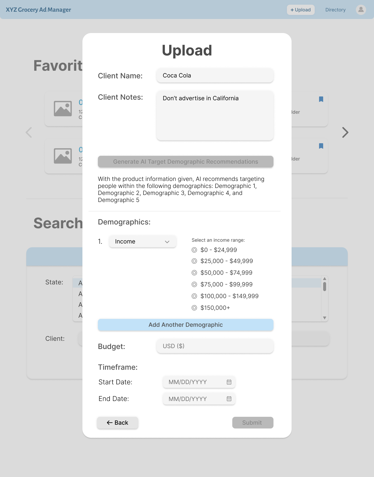
desired audience. My team and I brainstormed a long list of potential demographics to use in the system:
Age
Occupation
Race
Ethnicity
Dietary Restrictions
Income
Education Level
Marital Status
Gender
Household Size
Religous Affiliation
Employment Status
After analyzing these demographics, I decided that the most useful and telling demographics
for ad location assigment, specifically ads that are being shown in grocery stores,
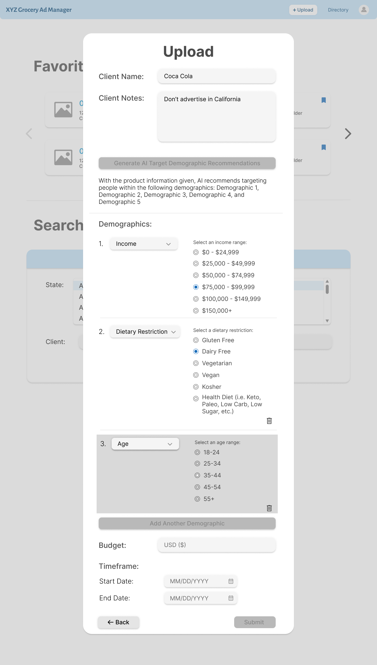
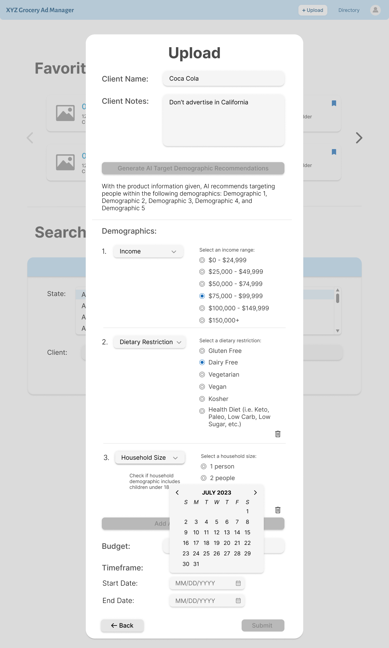
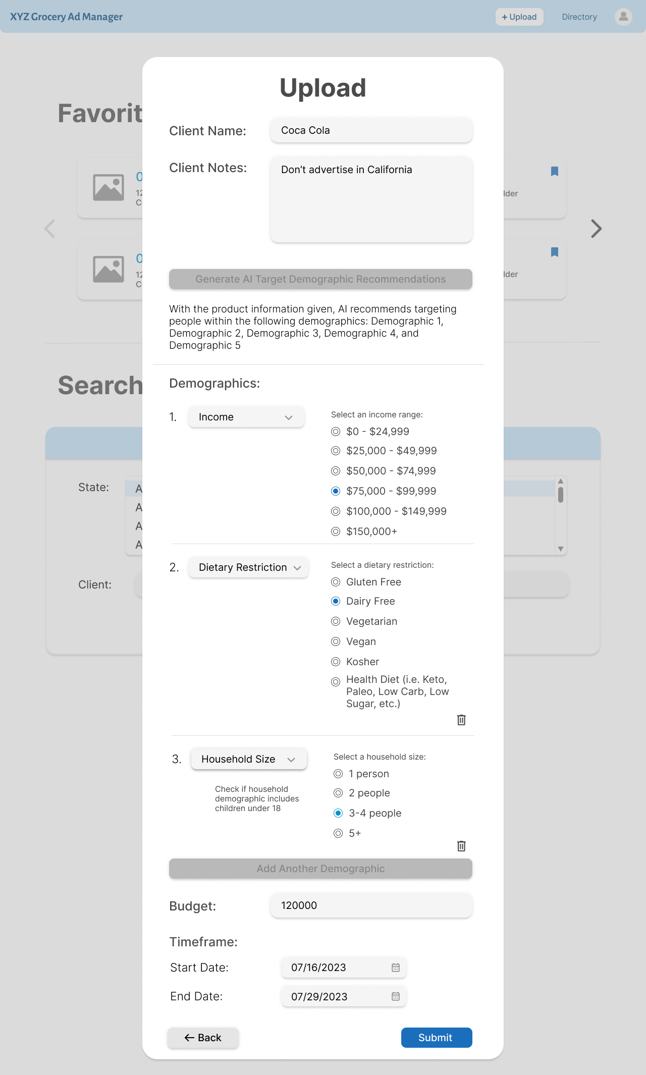
were Income, Dietary Restriction, Age, and Household.
RESEARCH - USER RESEARCH:
The next step in the research process was understanding who would be using our product. Again,
since this was a mock project, we didn't have direct communication with the client or the
intended users of the internal product. In order to more deeply understand our user(s), I created
a few personas.
Billy Smith was our main user, and who the MVP was mainly designed for. Billy
is a Media Partnership Associate at XYZ Grocery headquarters. His job consists of learnin what
retailers want for ad placement and accomodating those requests. He needs efficiency and organization
within his job, and struggles with customizing solutions for each customer and spending time
doing tedious, busy work.
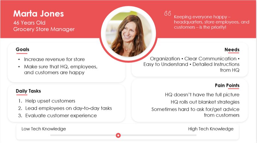
Marta Jones is the second potential user for this product. Once we defined base features that
would satisfy Billy's base needs, we thought about extra features that could be added to make
this product more unqiue and useful. Marta is the manager of a specific XYZ Grocery store. She
receives the ads that Billy assigns to her store and must manage when to put up and take down
the print ads in her store. It isn't always to easiest to understand when to do so with very little
communications from headquarters with the current process and system they use. The features I
brainstormed to help Marta were not included in the final prototype because of the short
project timeline, however, I outlined a few of these features in the "Next Steps" of the project.
Our final potential persona wasn't developed, but in the future we also wanted to develop an interface
for the retailers who wanted their ads placed. In "Next Steps", I discuss the details surrounding
this persona and their wants and needs in relation to the product.
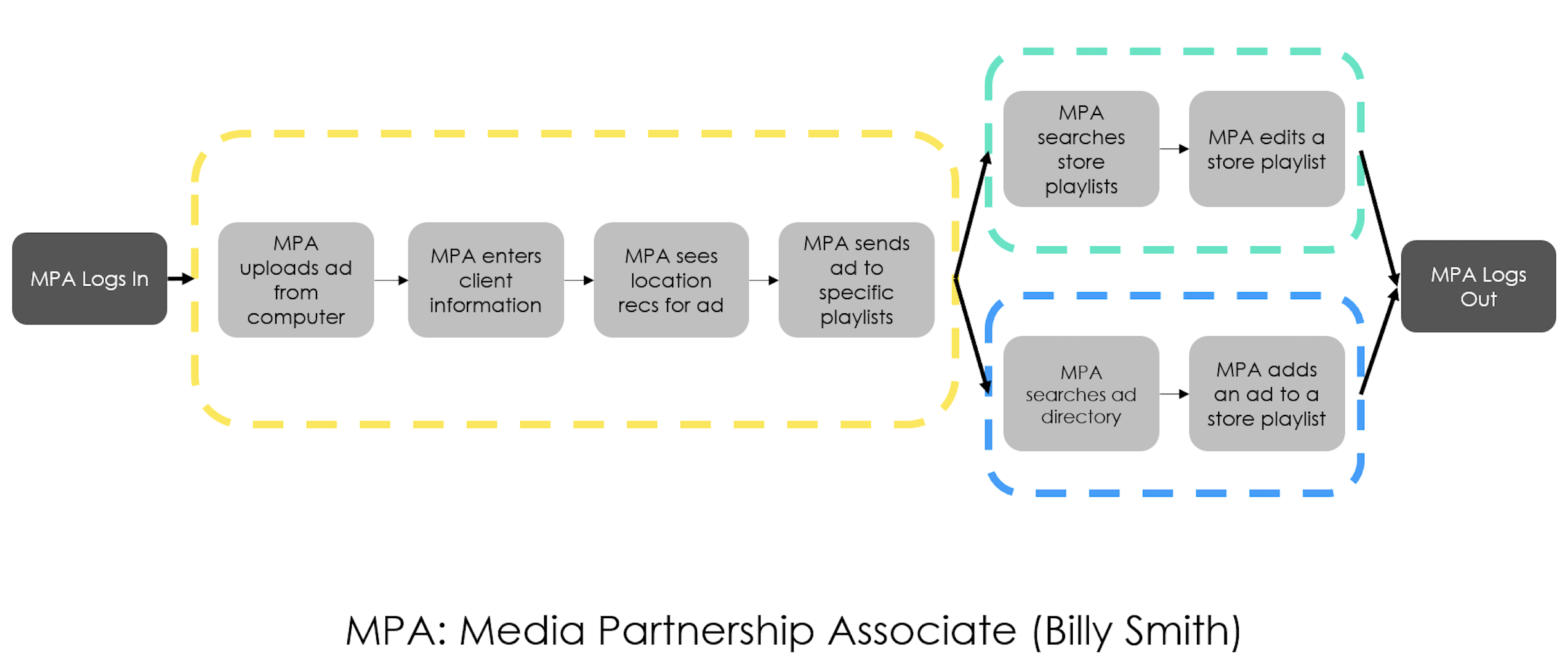
In order to define what features should be included in our MVP, V1, and V2 of our product, I
created a user journey for Billy of how he might use the product we developed in day to day life.
The tasks outlined in yellow came together to form the Upload Ad process. The tasks outlined in green
made up the Store Playlist Directory features. And the tasks outlined in blue made up the Ad Directory
features.
PRODUCT PRIORITIES:
MVP (Finish halfway through project)
Login and Account Page: Users are able to enter their account and see data that they have
saved.
Upload Ad: Users are able to add a new ad to their account and assign target demographics
and client notes to the ad.
Store Directory: Users are able to see all XYZ Grocery stores in the nation, as well as
the ad playlists associated with each store.
V1 (Finish by end of project)
Store Recommendations: Users will be able to get store playlist recommendations for ads
based on preferred target demographics, and will be able to edit this list, during the
upload process.
Ad Directory:Users will be able to see all XYZ Grocery ads in the
database, as well as the ad playlists that each ad is a part of.
V2 (Stretch Goal)
Store Manager View: Users will be able to log in as a store manager
and see all the ads specifically on the store's ad playlist.
Create Ad: Users will be able to create an ad based off of specifications
from the retailer, then proceed to assign that ad to ad playlists.
DESIGN PRIORITIES:
1. Display large amounts of information in the simplest way possible. Understand
which information is crucial, which information can be initially hidden on a screen, and which
information can be redacted and only stored in the database.
2. Improve efficiceny of ad playlist creation process with a clean
application interface and simple user journey planning.
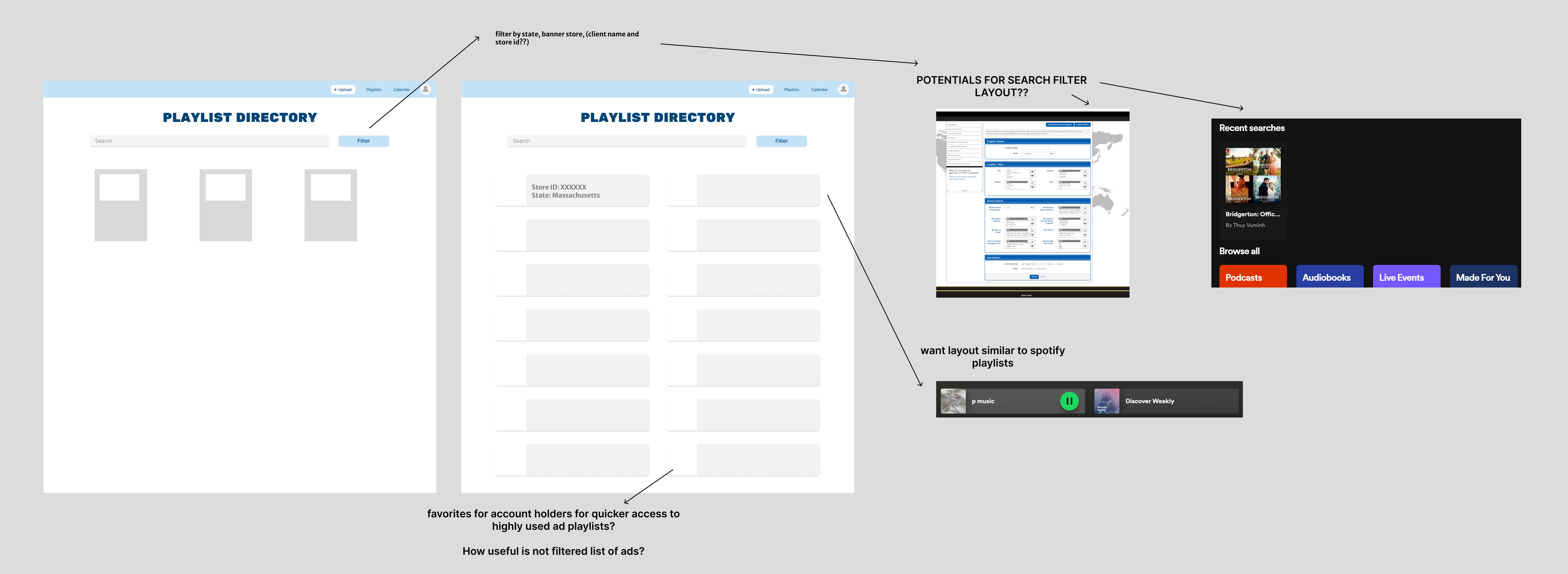
Without an industry standard for this type of product, I decided to take inspirations from
other apps that I use frequently to format the layout of this product. Specifically, when it
came to the playlist directory, I modeled the playlist view off of the desktop version of
Spotify.
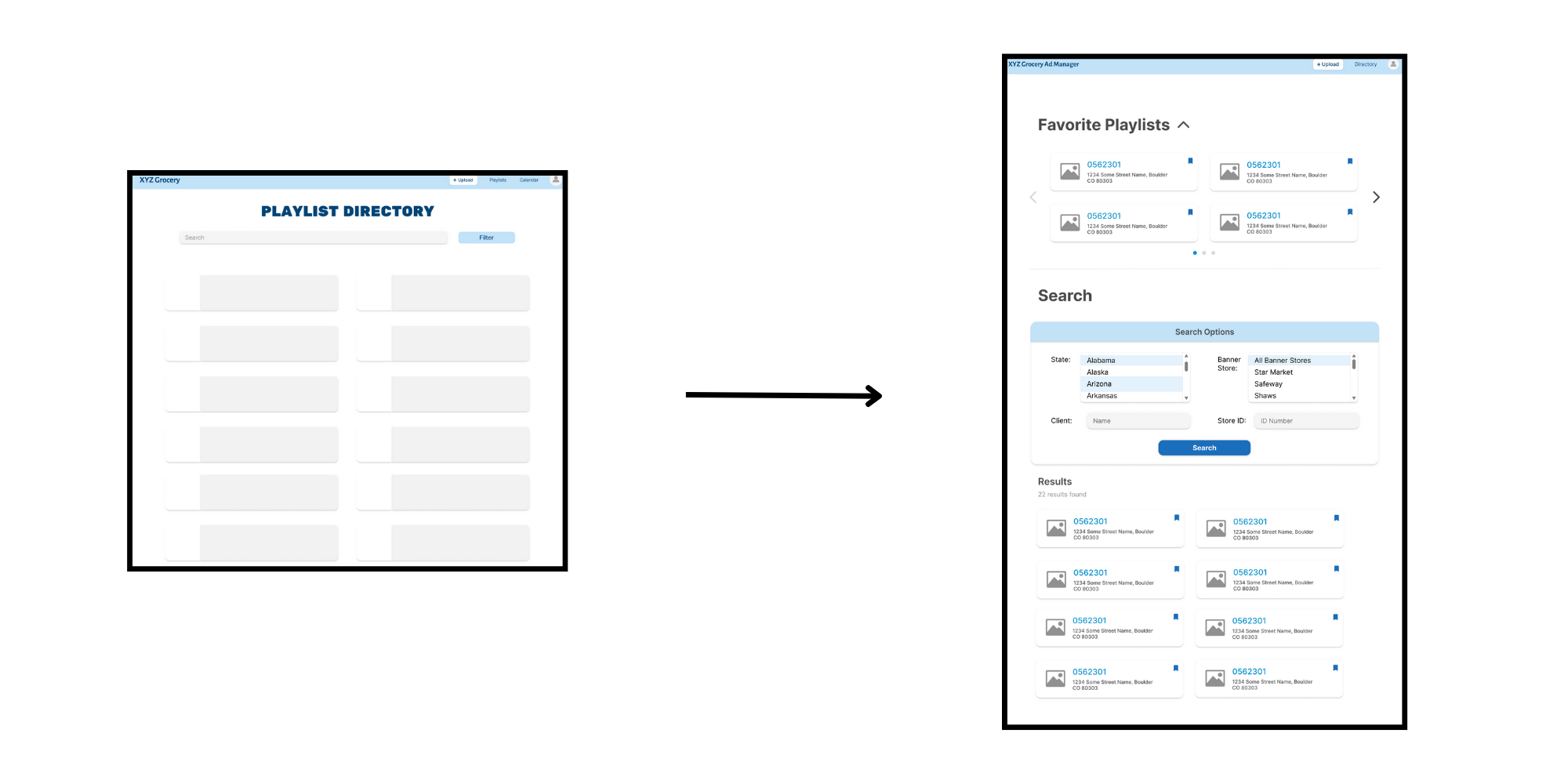
In addition, the playlist directory needed a complex search and filter feature in order to make
the directory useful for users such as Billy Smith. I took insprition from my university's
"Study Abroad Program Search" and modeled the filters off of that screenshot in later designs.
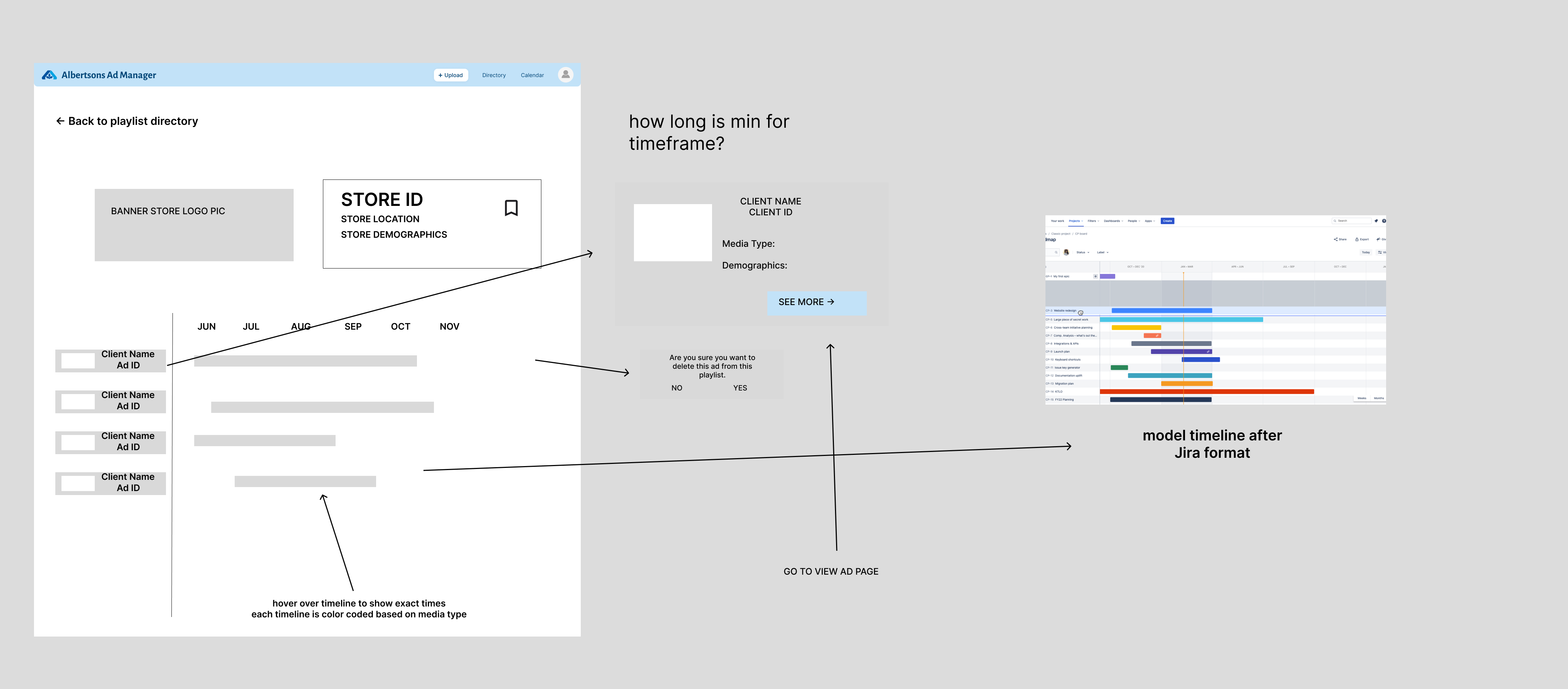
The view ad page also took some inspiration from the Jira Epics page for the timeline.
With so much information that we needed to include in this product, I wanted to find the best
way to display this mass of information in the cleanest and simplest way possible. Therefore,
brainstorming and looking for inspiration of many different ways to display data was a large part
of the design process.
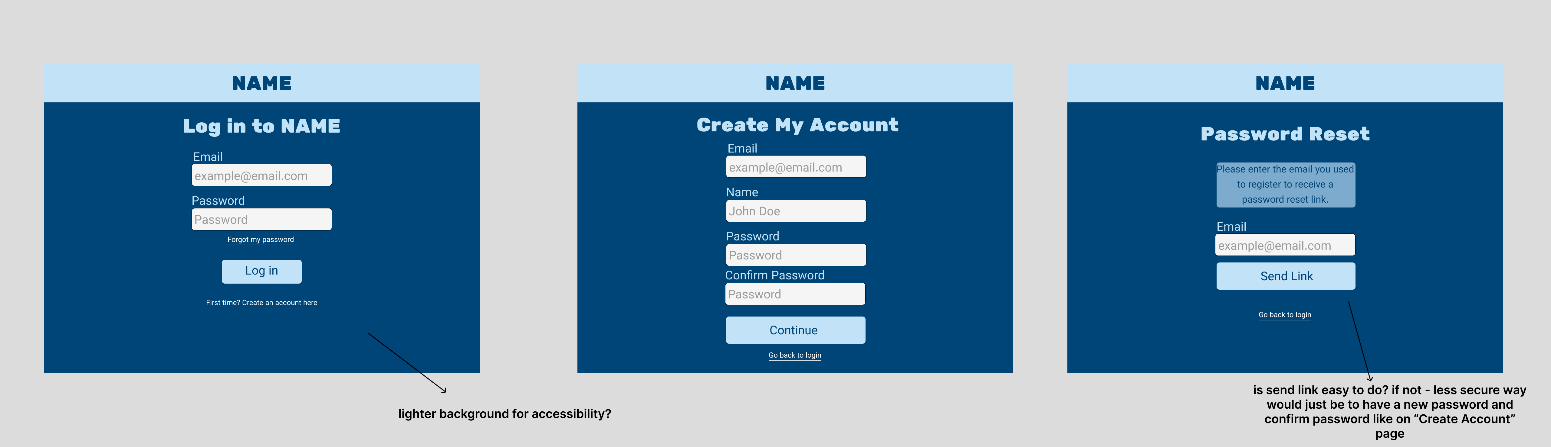
For the first iteration, I developed the design for the MVP features before asking for feedback. I took
the very basic mockups from brainstorming, and flushed out a more professional look. I developed
a few ideas of design items that I knew I wanted to be included into the product so that the engineers
on my team could start developing the base look of the product without the full figma final iteration
complete. I asked for feedback and conducted user testing on these designs because the majority
of the rest of the product would be designed similarly to these features.
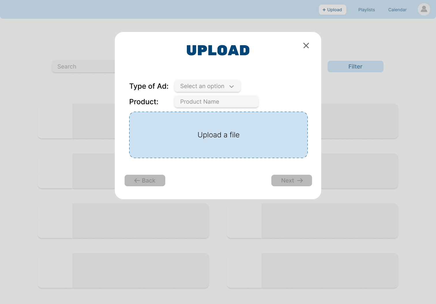
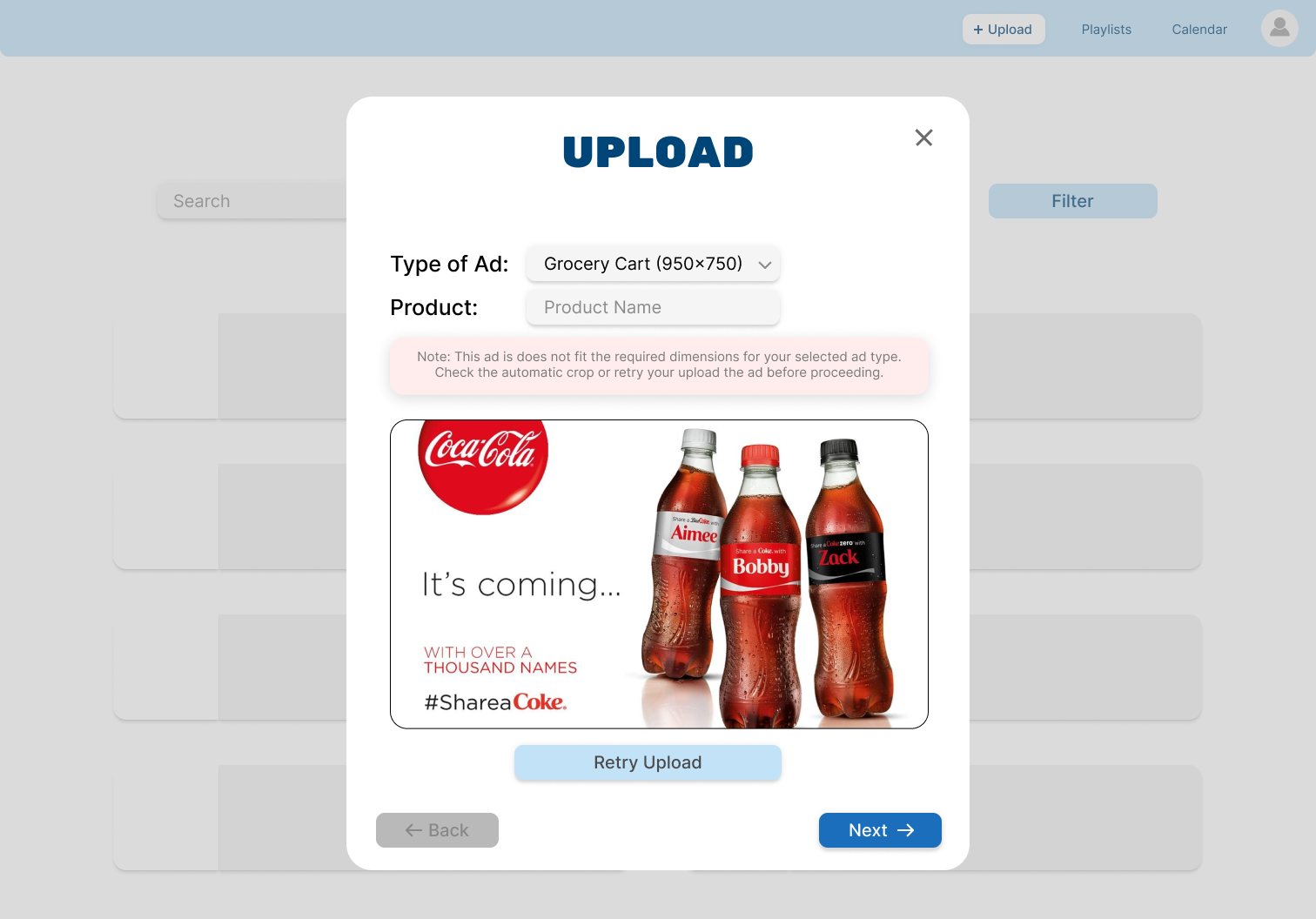
Also note that these screenshots are missing logos and store names due to the
confidentiality of the mock client.
USER TESTING:
Due to the quick nature of the project, I only had time for one iteration before asking for
feedback and providing the final designs to the engineers. The user testing process was extremely
informal because we didn't have access to the target audience we were building the product for.
I reached out to a product design coach within Publicis Sapient for feedback, and we also conducted usability
tests within our intern cohort. The feedback I got was mainly regarding small details related to the
accessibility aspects of the product. I changed things such as text color and button background color
to make sure the contrast was visible to those with visibility impairments.
I also specifically
asked for feedback on the information visible on each screen, and how to reduce feelings of information
overload. Based on the feedback, I made a few big changes to the Playlist Directory Page:
Changes Made:
Initially, I realized that having a long list of ad playlists was not useful at all for
Billy to scroll through. When we added a search bar to the initial iteration, I got feedback
that there were too many different things that could be searched for to find a playlist that
the search feature would be kind of confusing to learn. From there, I developed several ways
to search through the list, including a "favorites" feature and a detailed search filter function.
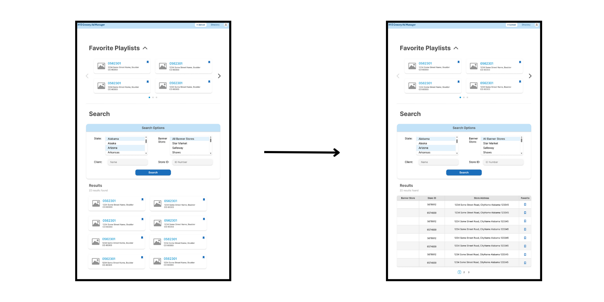
After that, I got feedback on the layout of the search results, learning that it was too similar
to the favorites feature, and took up too much screenspace for it to be used. After hearing this,
I changed the layout to be more table-like, and this got positive responses and had more potential
to actually be used to be more efficient.
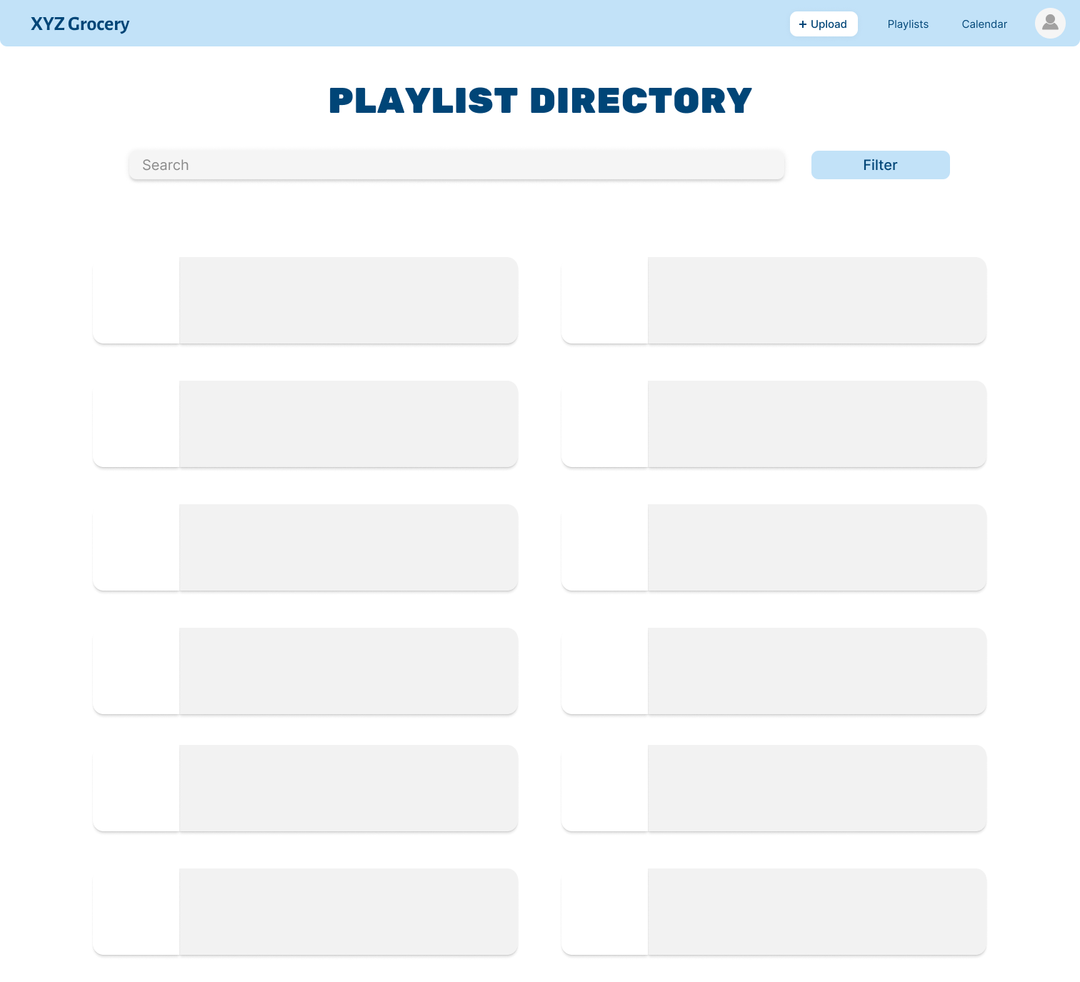
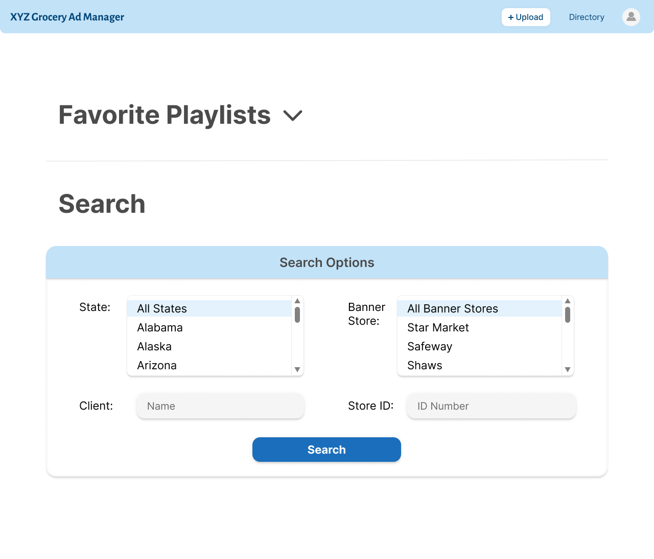
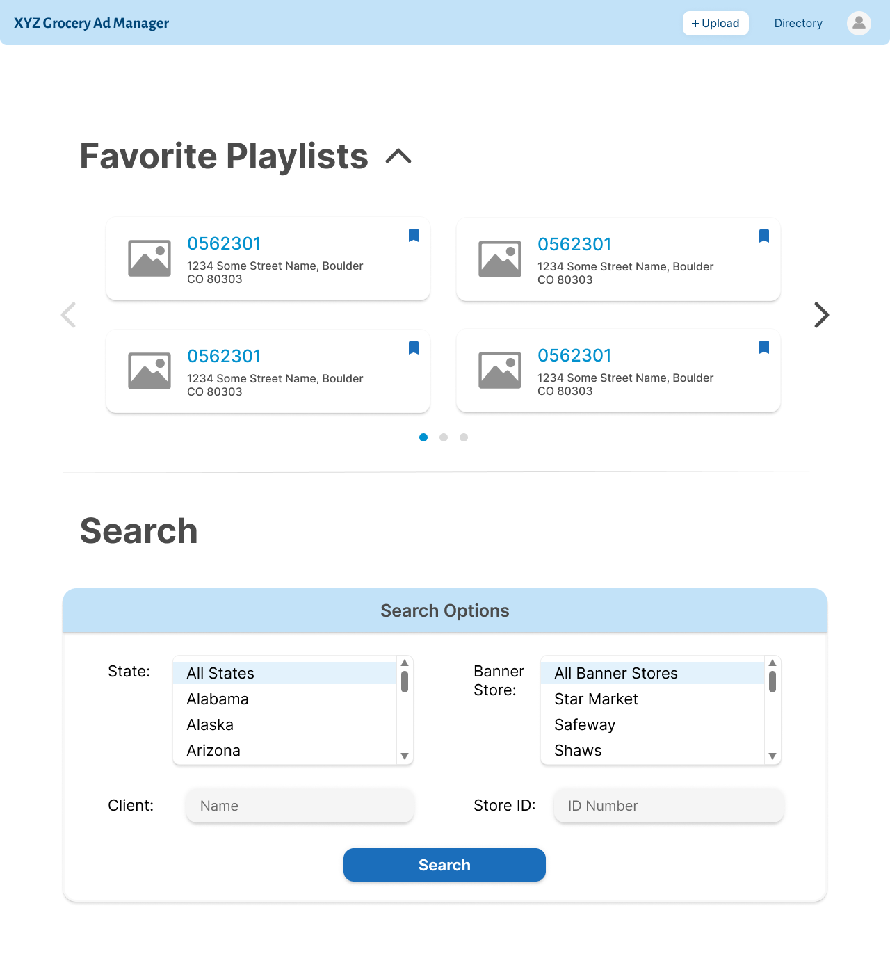
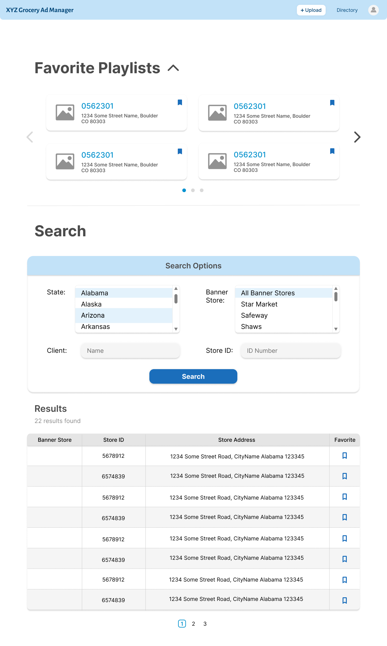
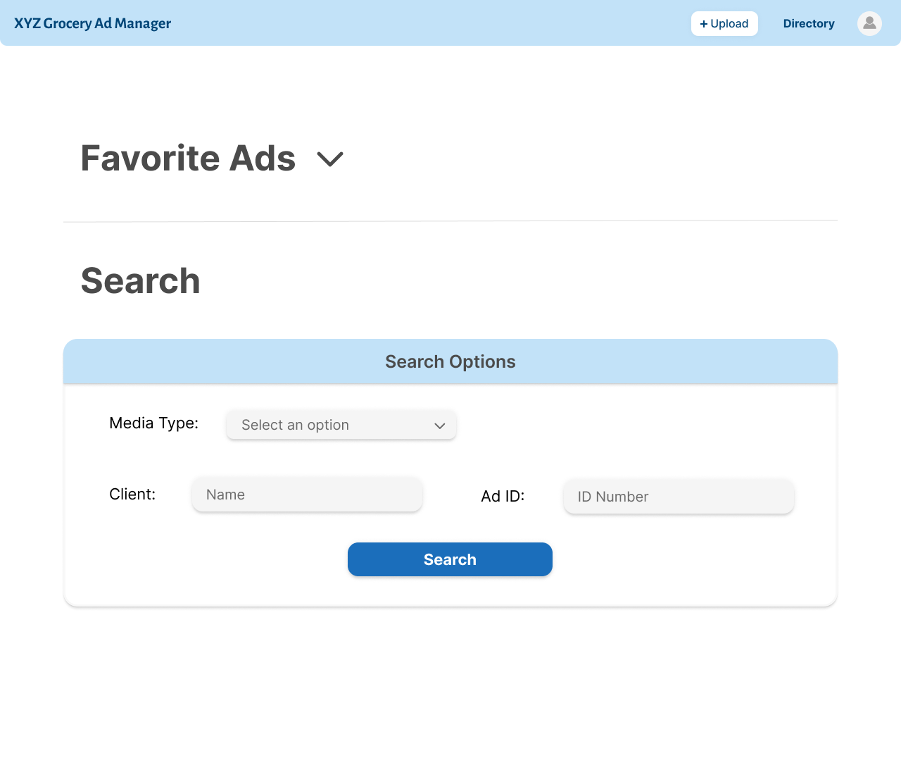
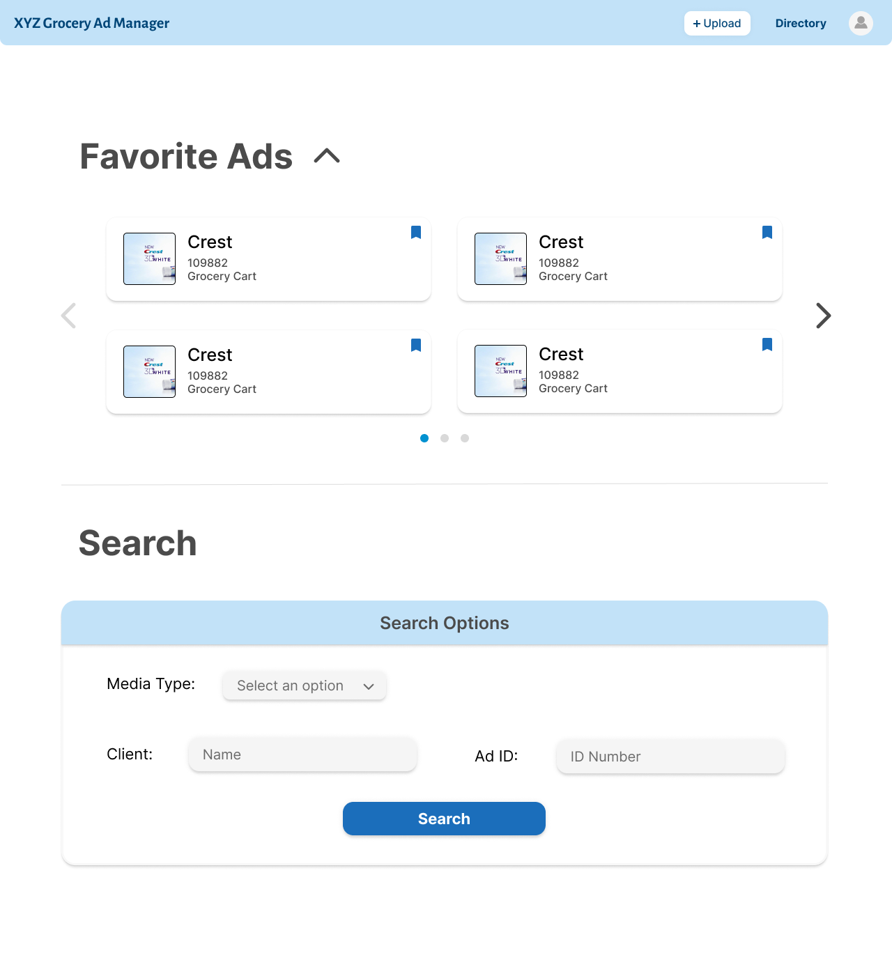
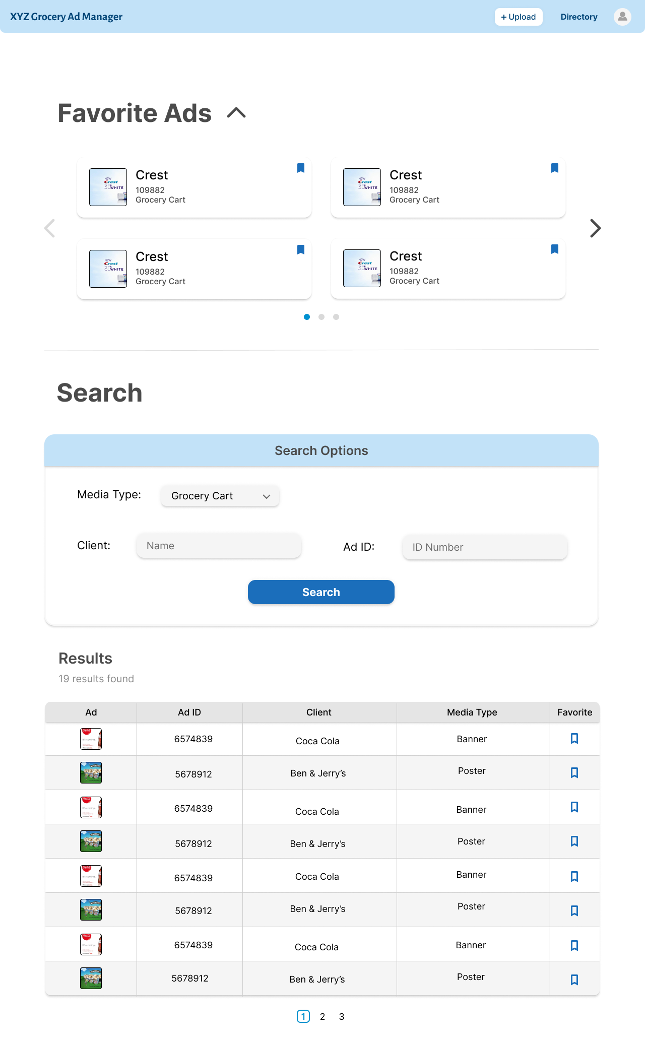
The playlist directory is the home page of the product. I made the default view with the favorite
playlists closed so that the amount of information shown wasn't overwhelming. The
search and filter options are the ones that would make most sense for what someone like Billy
would use to search for a playlist. In addition, the search
results are displayed in a table, and the view is also paginated to reduce the amount of information
on the page.
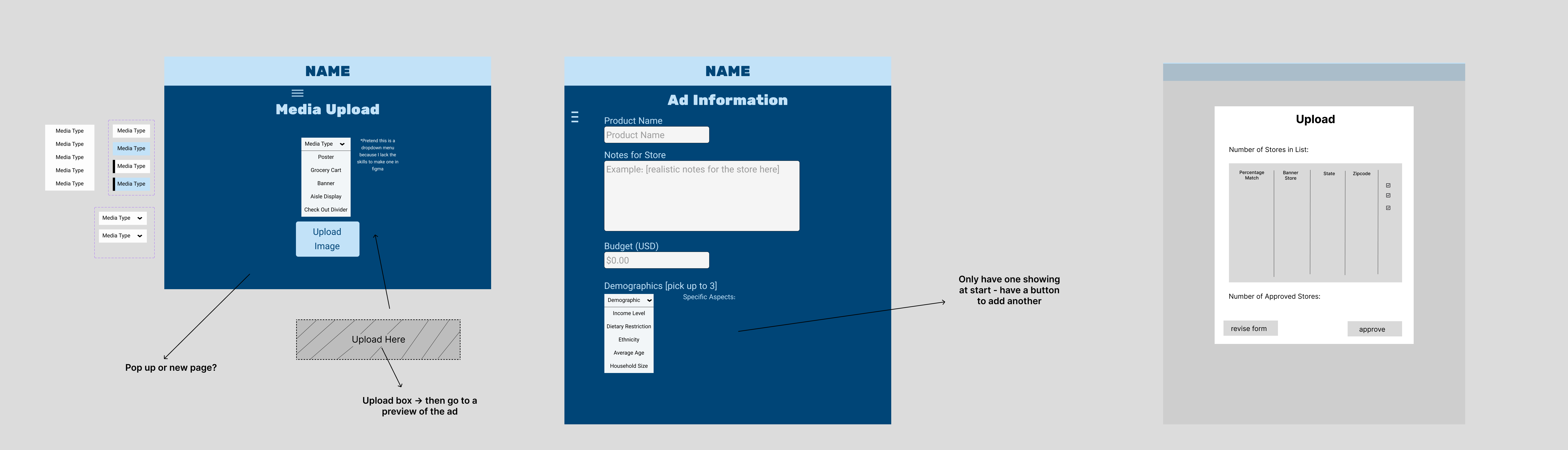
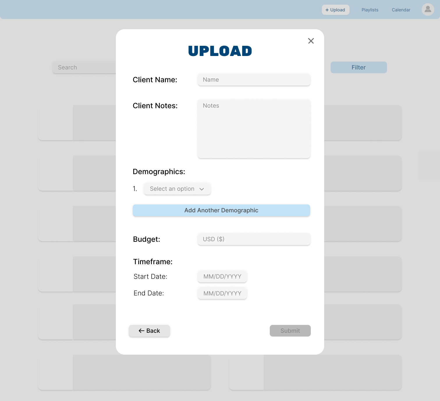
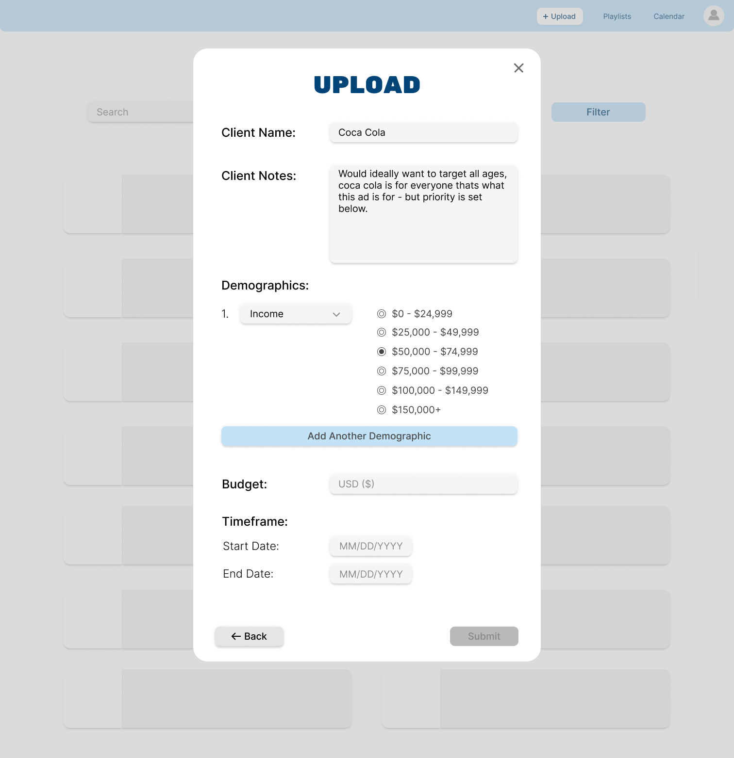
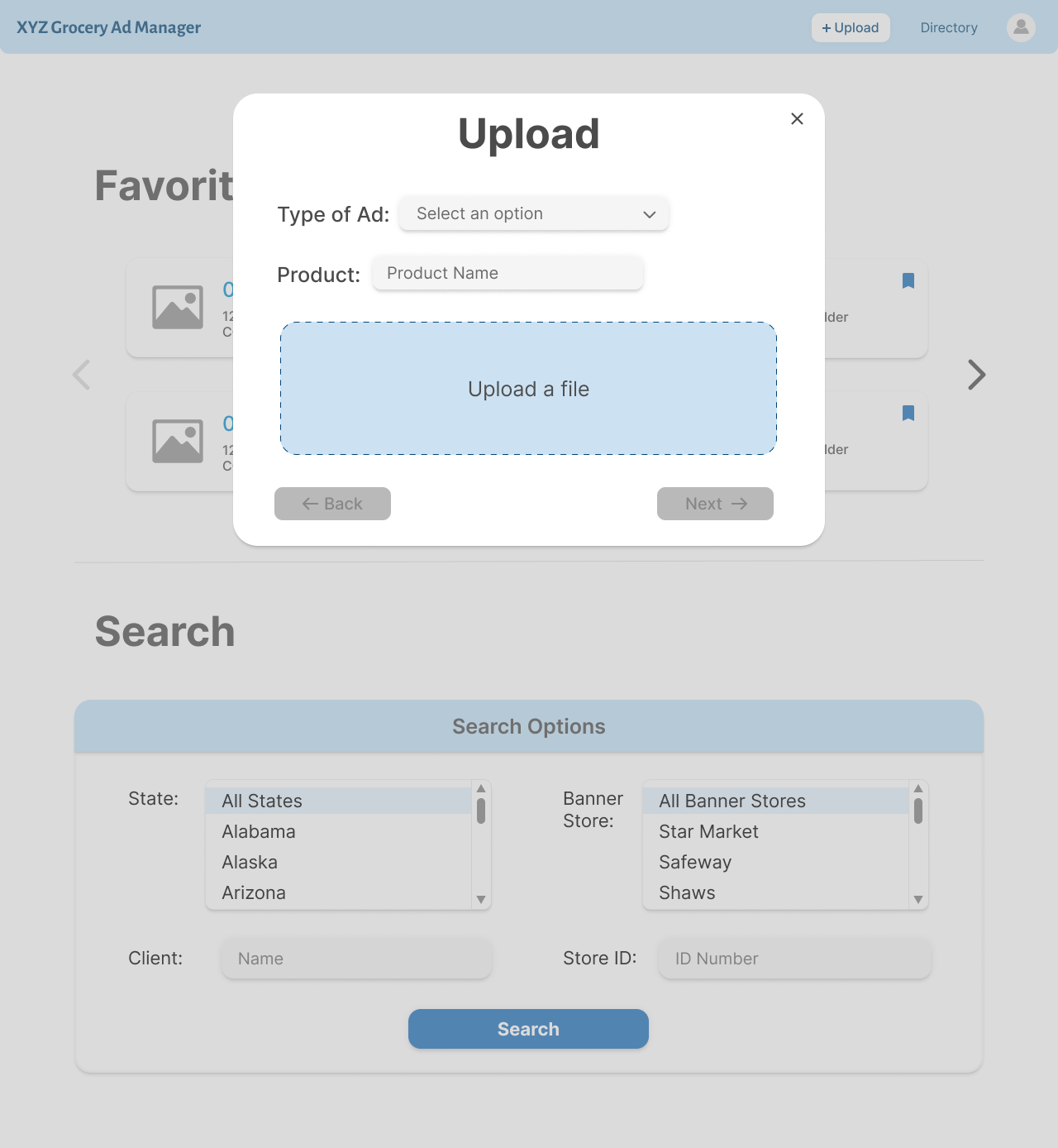
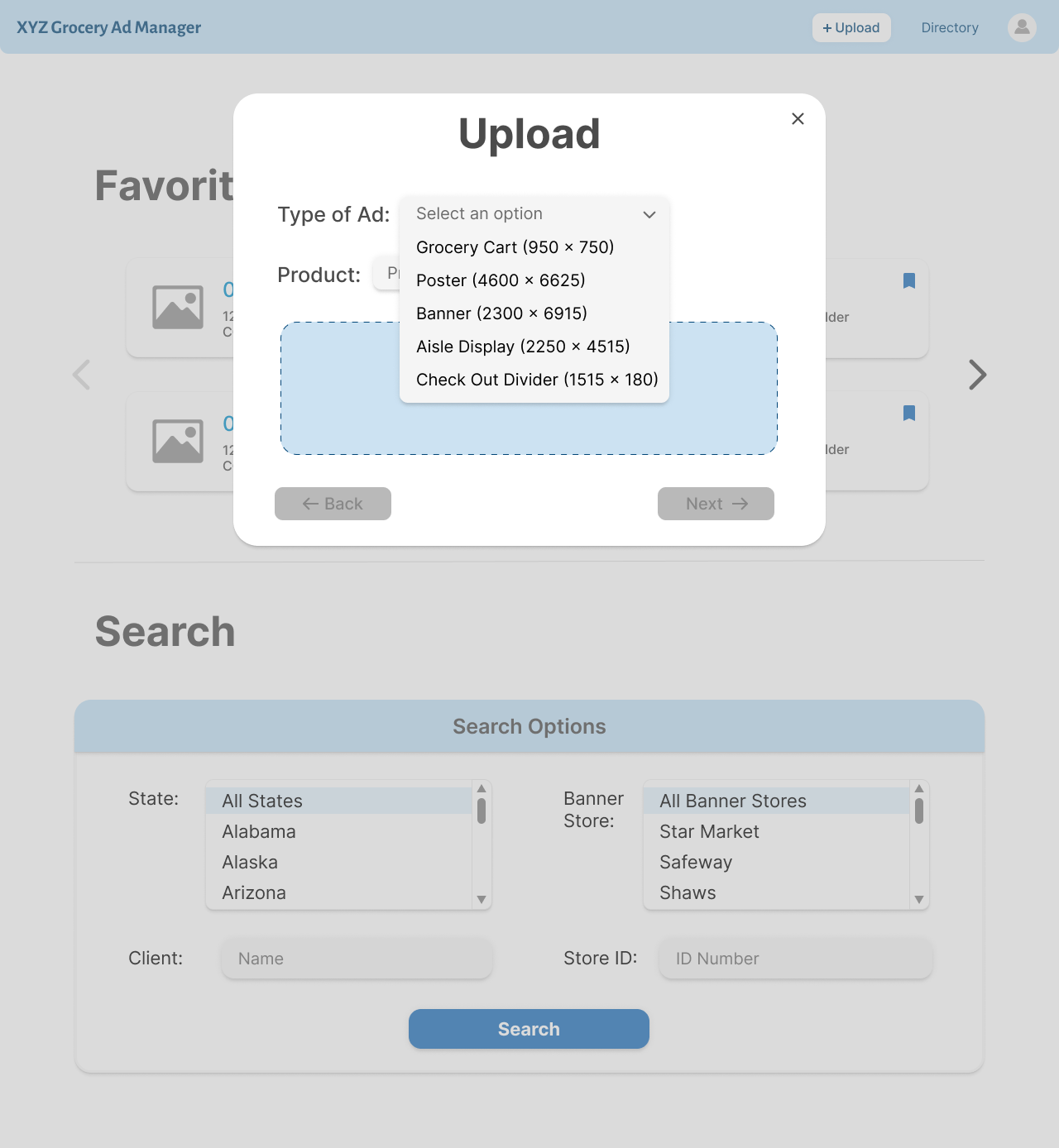
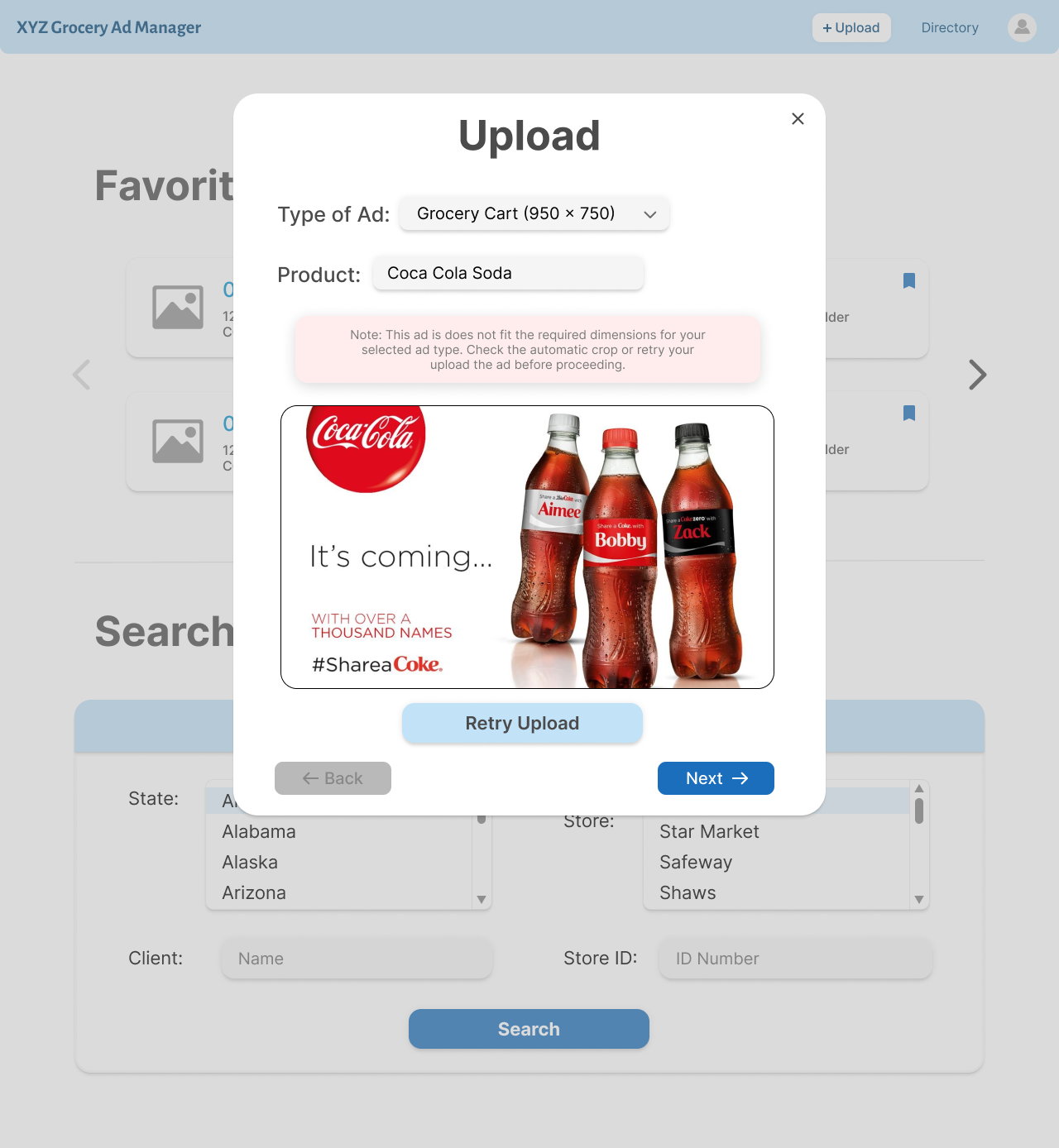
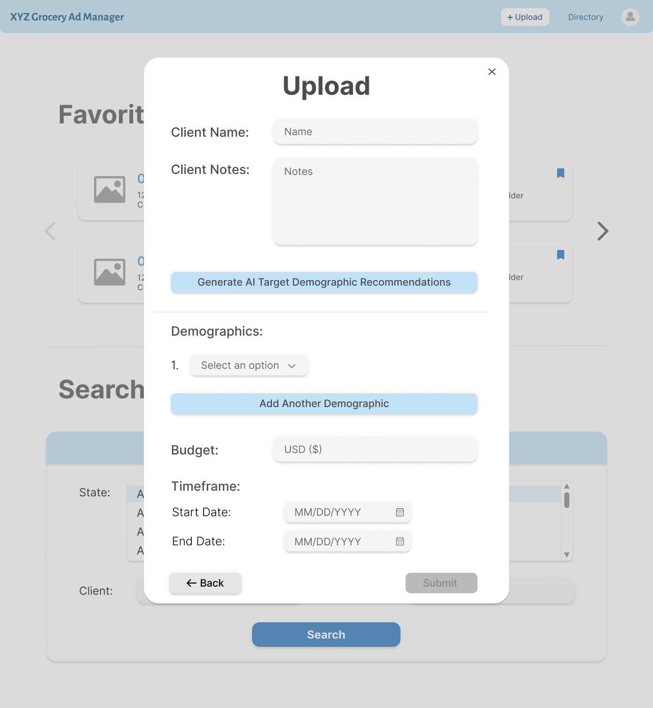
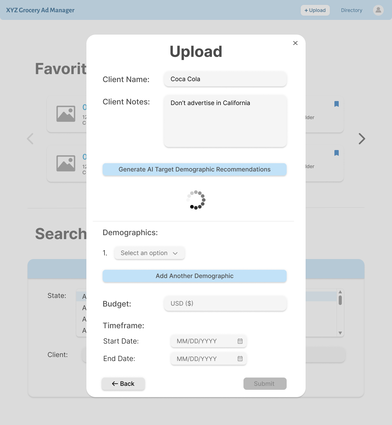
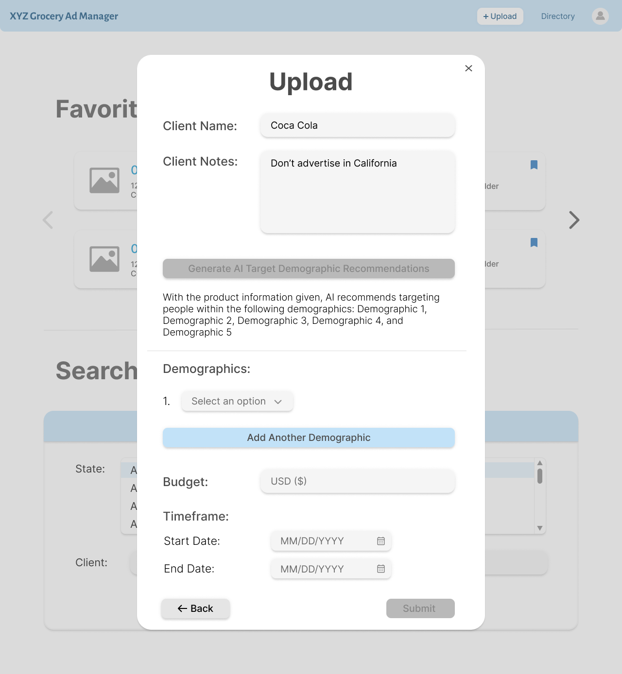
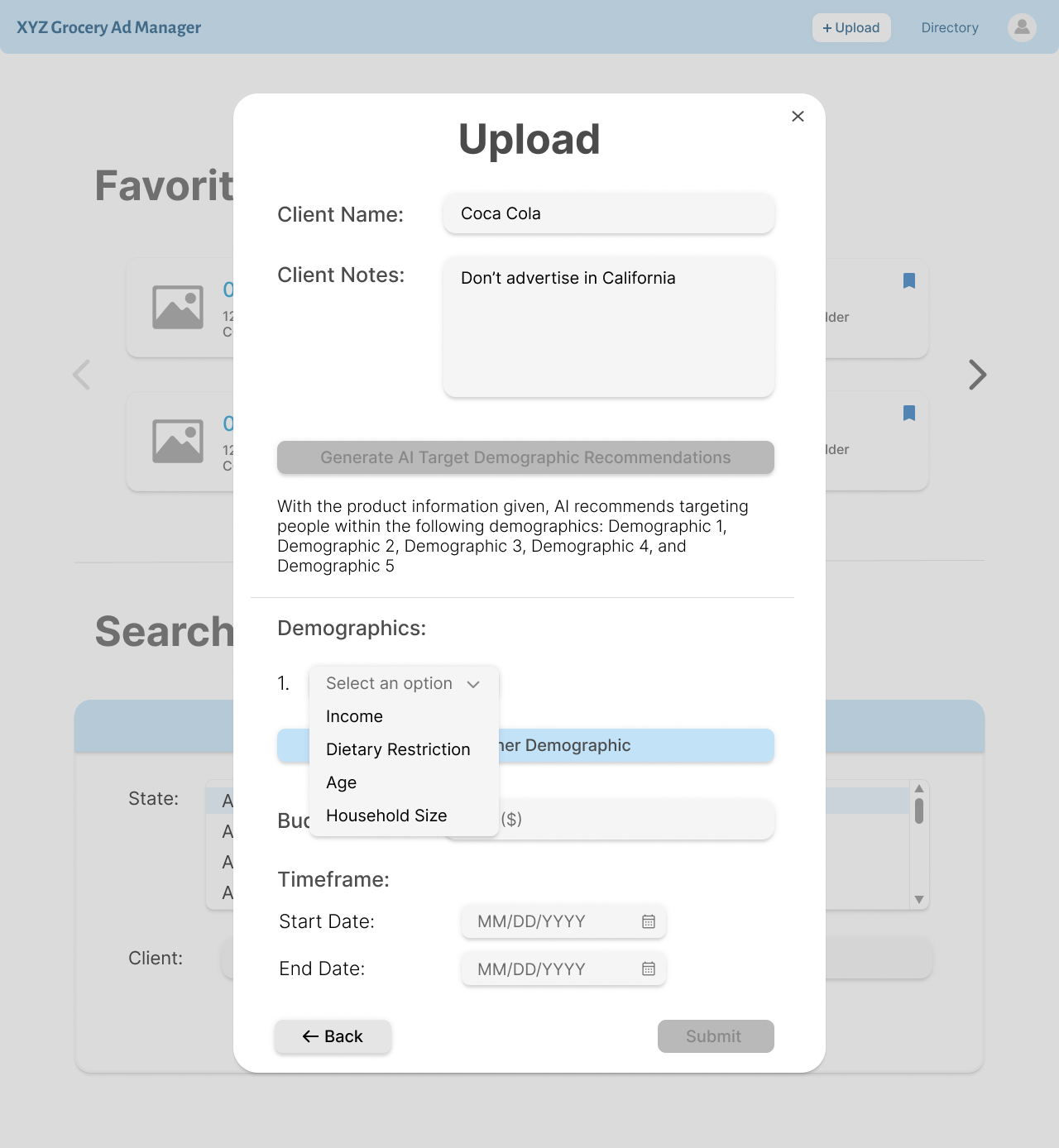
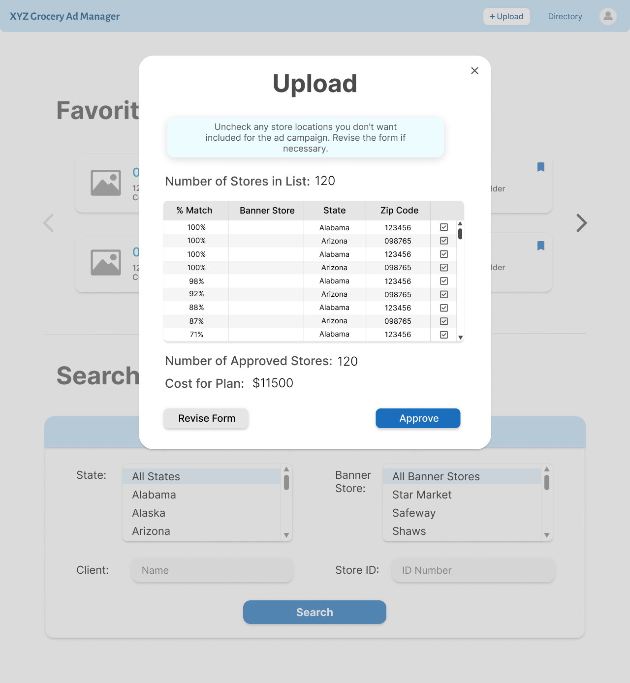
The upload process is split into 3 parts. The first part is uploading the actual ad and making
sure that the dimensions are correct. The second part is understanding the client, learning the
AI generated demographic recommendations, and entering in the demographic, budget and timeline information.
The third part is seeing the location recommendations based off the recommendation algorithm and
editing this list before sending the ad to the specified playlists.
The ad directory is modeled very similarly to the playlist directory. The search options are only
media type, client, and ad id, because the other information linked with the ads is too broad to
search for.
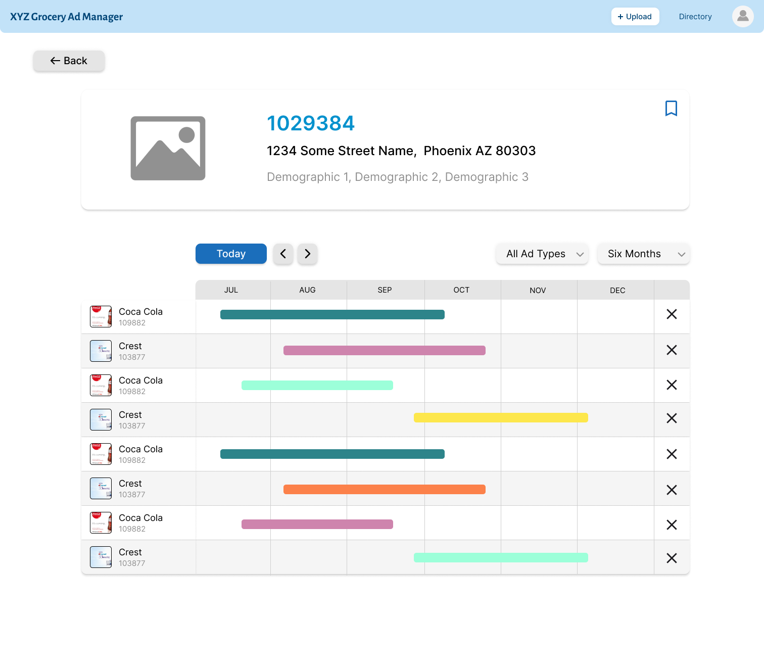
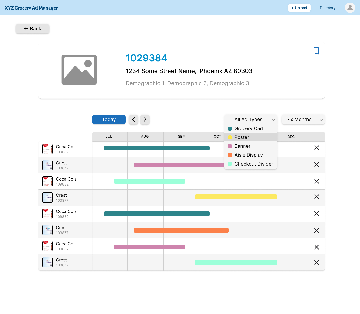
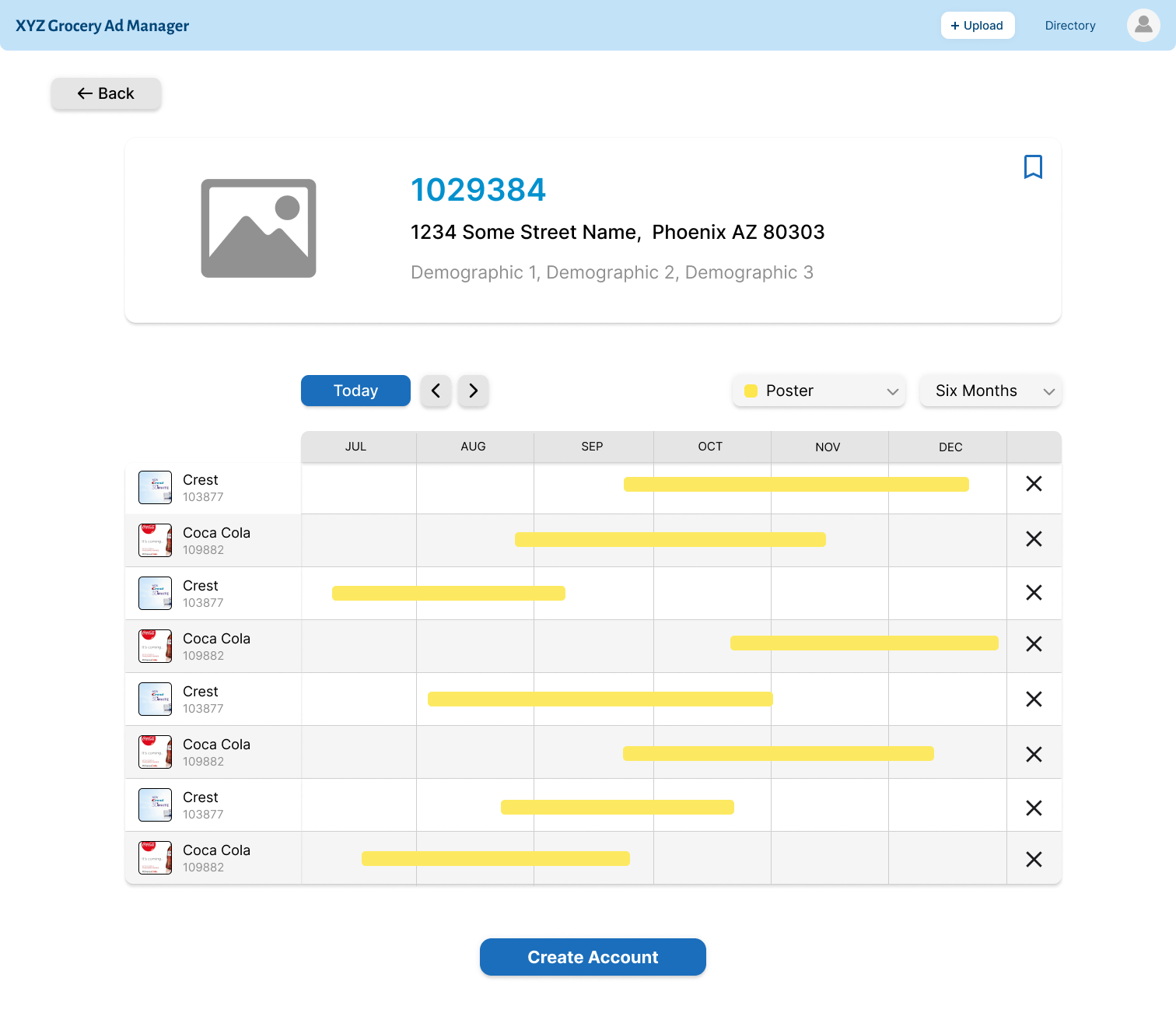
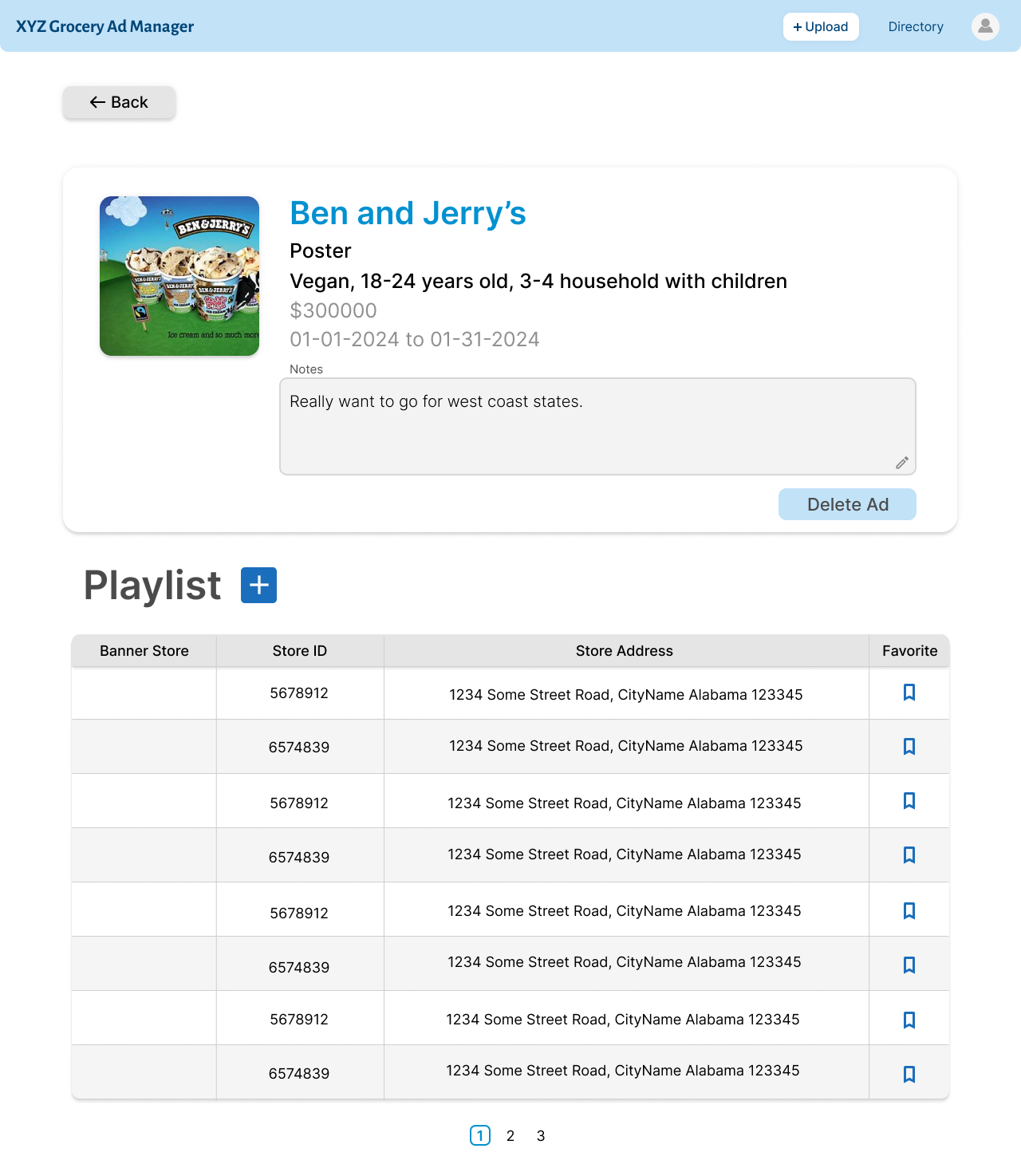
When viewing a specific ad playlist, you are able to see the demographics associated with
each store. Each ad scheduled at the location displays the length of time it should be shown
in the store, and the type of ad is able to be filtered. You can edit the list of ads
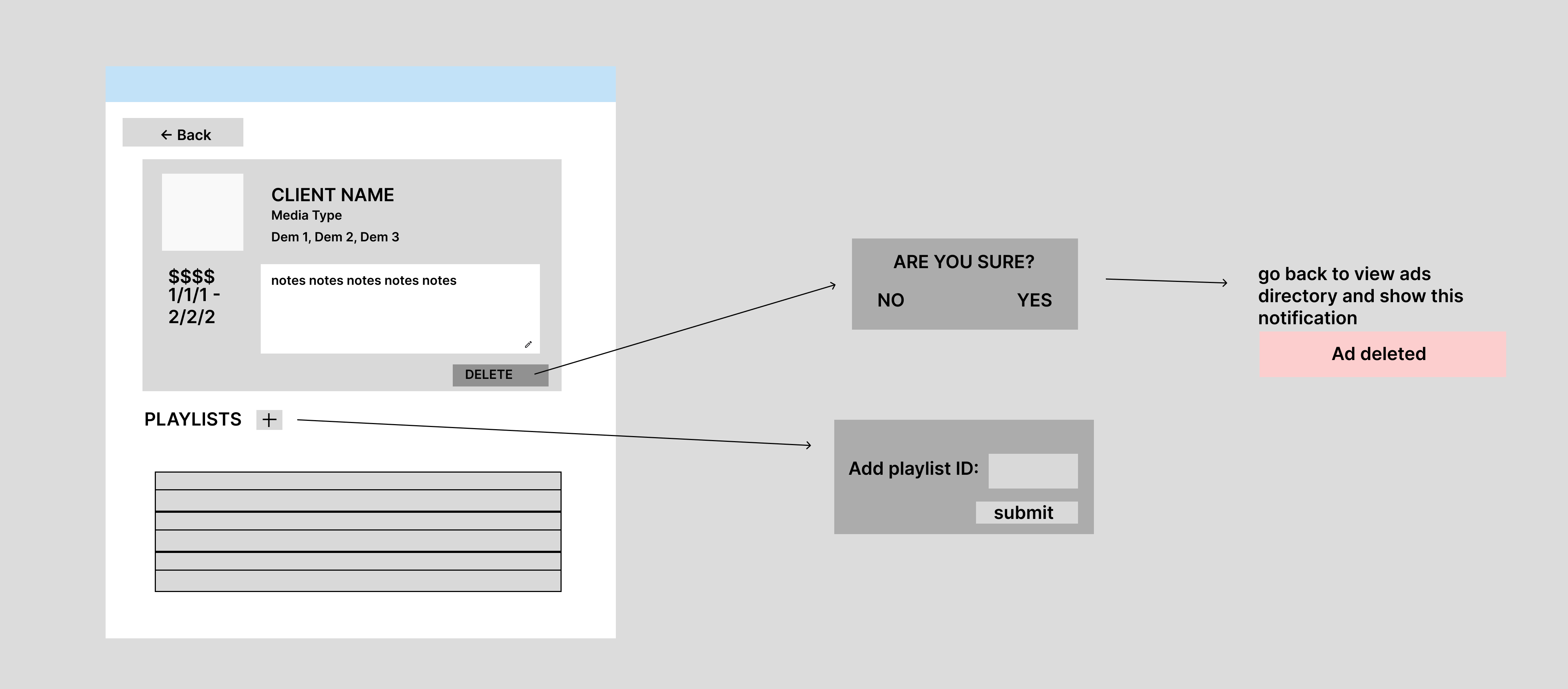
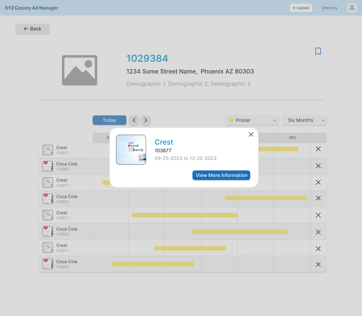
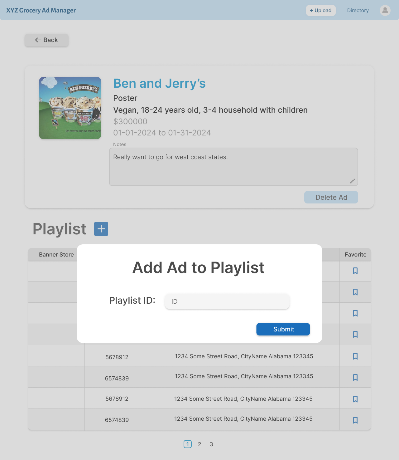
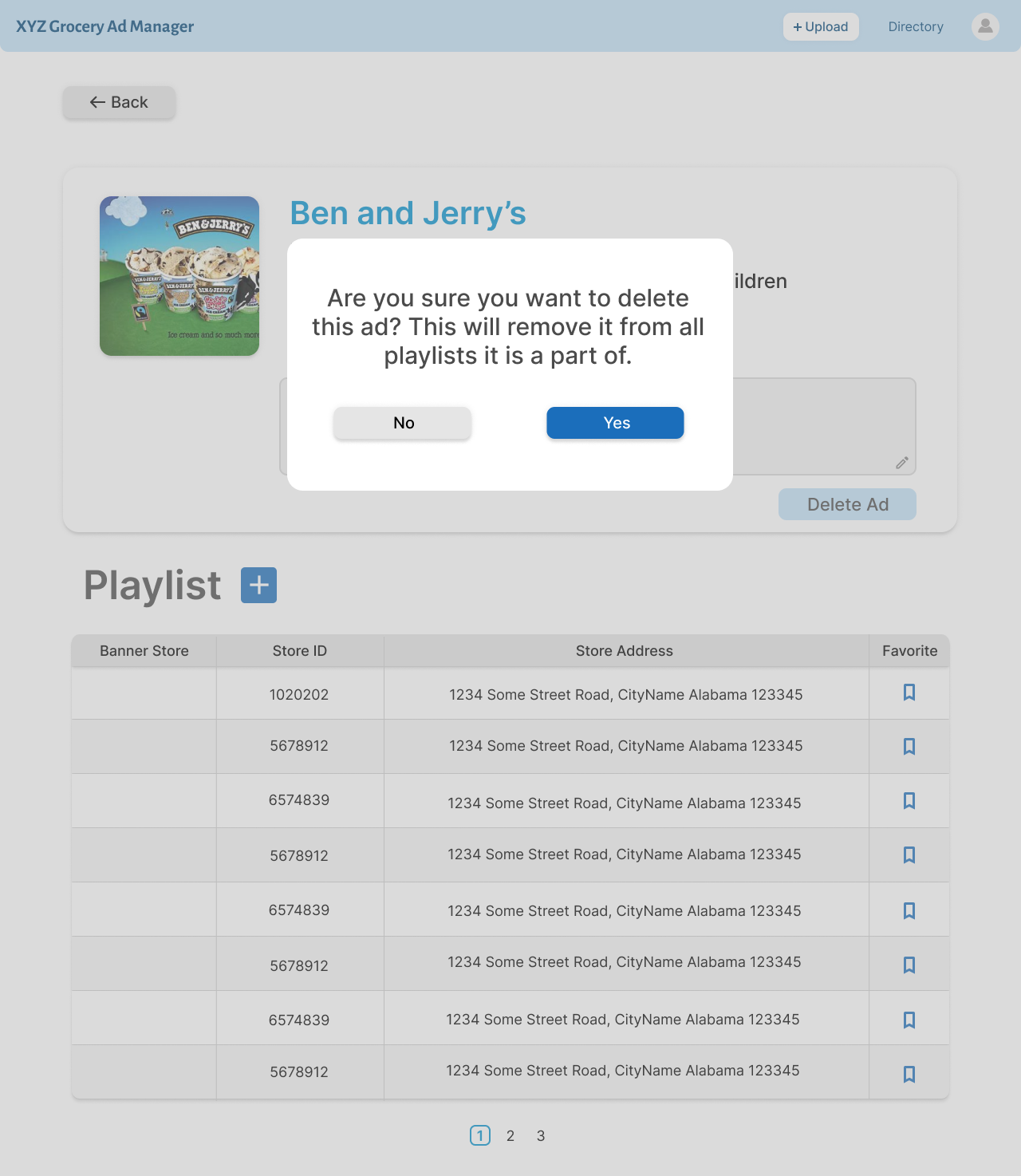
in the playlist. By clicking a specific ad, you can view a specific ad.
When looking at a specific ad, you are able to see all the information that was entered
into the upload screen. You can also see all the playlists that the ad is a part of.
Note: This video is the actual coded prototype. This video is Private on Youtube because it shows the client
and several client details, so if you want to see this video, you must request access from me directly.
POTENTIAL NEXT STEPS:
In terms of the engineering tasks, scaling for a larger database for the product shouldn't
be a problem because of the technologies the engineers used. In terms of product design, I would
want to conduct user testing with the actual users of this product. That would mean getting access
to the MPA's at XYZ Grocery. In addition, I would want to get real data from XYZ Groceyr. The
data we used was generated by AI due to the mock nature of the product, so by getting real data,
the ad playlist recommendations would be more accurate.
In terms of next steps for features, I planned out the next 3 sprints as well as larger future
features to impliment. In Sprint 5, I would like to implement a feature called "I know where I
want to place my ads", which would be useful when someone has very specific locations they want
to place their ad instead of using the recommendations. In addition, I want to make the location
recommendation based off of item popularity and season of the year. These are both features my
team wanted to add after the initial brainstorming session. Sprint 6 and 7 are outlined in the
presentation above.
In the far future, the Retailer view should be implemented and this product should be aligned with
XYZ Grocery's media collective, which would allow for the use of real, and more accurate data. All
of these steps would help lead XYZ Grocery to a more full digital business transformation.
REFLECTION:
This project taught me the importance of always placing the customer first. As I was leading
my team, I imagined that our persona Billy was our 10th team member. Keeping Billy in mind at
all times was important, especially when making assumptions on which features would be most
useful to him, and therefore deciding the priority of features to build.
My team didn’t have any designers on it, so while my official role was a Product Manager,
I also took on many of the UX Designer responsibilities so that I could ensure that our product
was intuitive and useful for the target user. This meant that I had to balance both roles’
responsibilities in order to keep the project moving and finish the MVP by the
end of the project timeline.
Overall, I loved the fast paced environment that I was
placed in throughout this internship. I learned so much about many parts of creating a product,
consulting with clients, and incorporating acccessibility into my designs. I also built
leadership skills when guiding my team through this project, and learned a lot about
communication and collaboration, as well as when to direct and when to let my team members
make their own decisions based on their specific areas of knowledge.


.png)


.png)
.png)
.png)
.png)
.png)
.png)
.png)
.png)
.png)
.png)
.png)
.png)
.png)
.png)
.png)
.png)
.png)
.png)
.png)
.png)
.png)
.png)
.png)
.png)
.png)
.png)
.png)
.png)
.png)
.png)
.png)
.png)
.png)
.png)
.png)
.png)
.png)
.png)
.png)
.png)
.png)
.png)
.png)
.png)
.png)
.png)
.png)
.png)
.png)
.png)
.png)